WEADE - Workflow for Enrichment Analysis and Data Exploration

Documentation

Getting Started

If this is your first time using this app, consider taking the guided interactive tour by clicking the orange button in the top right. If you need a hint about what a specific setting or button does, click the question mark in the top right corner, this will display content-aware hints.

If that does not answer all of your questions, you can find a complete documentation below.

You can address any further questions about WEADE to Nils Trost, nils.trost@stud.uni-heidelberg.de

FAQ

How is my uploaded data stored? Can anyone access it?

Your data is only stored during the session, it is not accessible for anyone else but you for the analyses. Please refer to our Terms of Use for more details.

The app is taking a long time loading an analysis. Will it ever finish?

If the application shows a loading screen for more than roughly 5 minutes, something most certainly went wrong. Try reloading the page and running the analysis again. If the issue keeps happening, contact Nils Trost, nils.trost@stud.uni-heidelberg.de.

The Analysis

Singular Enrichment Analysis (SEA)

The tool uses the Fisher's exact test to calculate the enrichment of a category or a term from a list of genes. The resulting p-Values are adjusted for multiple hypothesis testing with the Benjamini-Hochberg method when testing on categories. Additionally, the term-frequency or odds ratio is calculated.

Gene Set Enrichment Analysis (GSEA)

The tool performs a Mann-Whitney U-test on a set of genes with an associated continuous measure. The resulting p-Values are adjusted for multiple hypothesis testing with the Benjamini-Hochberg method when testing on categories. This way, no threshold has to be set, all genes are considered and weighted according to the provided measure. Additionally, the delta-rank of each category or term is calculated.

The User Interface

The Side Tabs

The side tabs contain the options that you can set to perform the analyses.
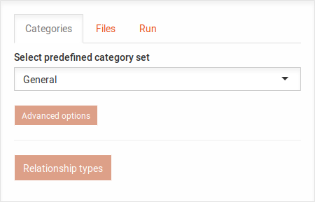
Categories

Category tab general options.

In the Categories tab, you can select the predefined category sets for the analysis. You may click on the Advanced options or the Relationship types button to reveal the following options:
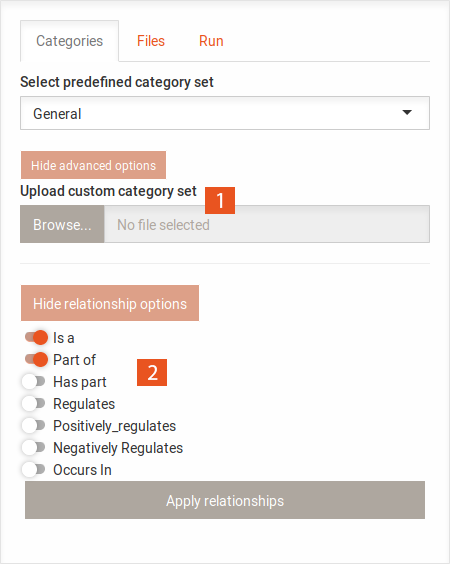
Category tab advanced options

  1. Here you can upload your own set of categories. The file should be in the following format (no header):
    GO id    GO term    Name for category
    It is possible to directly load a basket export from QuickGO as a category set.
  2. Here you can select the GO edge types that should be included when creating the graph. The default is is a and part of.

Changing the set of categories will reset the heat map and history, as it makes the analyses incomparable.
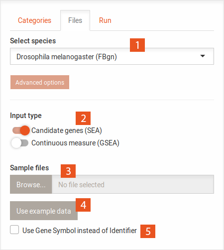
Files

Files tab general options

  1. Already supported species are displayed in a drop down menu. The identifier that is used in the annotation of genes to GO terms is found in parenthesis after the species name.
  2. Here you can select the type of your input files, this will determine the type of test that is run on your data.
  3. Here, you can upload your files. You can upload up to four files at a time when performing an SEA, or one at a time when performing a GSEA. The following format is used for candidate gene lists (SEA), one gene per row:
    ...
    Gene1
    Gene2
    Gene3
    ...

    The following format is used for gene sets with an associated continuous measure (GSEA), two comma separated columns:
    ...
    Gene1,-0.2
    Gene2,2.3
    Gene3,1.4
    ...
    The files should not include any header.
  4. To test the tool, you can also use example data by clicking this button.
  5. It is generally safer to use the gene identifier that is indicated in the species selection. However, it is also possible to use the gene symbol (called external_gene_name in biomart and ensembl) by clicking this button. Conversion might be ambiguous, be sure to check the Where are my genes? button in the Genes tab.

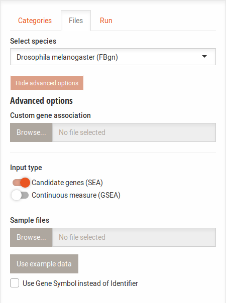
Files tab advanced options

Clicking the Advanced options button below the species selection shows the upload area for custom annotation files. With this, you can use an alternate identifier for species that are present or run the analysis on other species. The file format for this is as follows:
...
FBgn0041711    GO:0005576
FBgn0041711    GO:0048067
FBgn0041711    GO:0016853
FBgn0041711    GO:0042438
FBgn0042110    GO:0003674
FBgn0042110    GO:0003824
FBgn0042110    GO:0016740
FBgn0042110    GO:0016772
FBgn0037149    GO:0005575
FBgn0037149    GO:0003674
FBgn0037149    GO:0008150
FBgn0039007    GO:0007165
FBgn0039007    GO:0007154
FBgn0039007    GO:0007186
FBgn0039007    GO:0008150
...

The file should be a tab separated text file with two columns. The first column should contain the gene identifiers and the second column the corresponding GO term. If a gene identifier is associated with more than one GO term, put each association in a separate line.

You may also add a third column containing gene symbols for display instead of the gene identifiers.
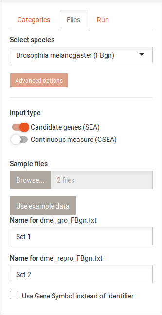
Files tab set names

After uploading input files, you can enter names for the sets. These names will be displayed in the Venn diagram. This optional but helpful, if the file names are not clear.
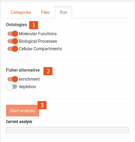
Run

Run tab

  1. Here you can choose which of the three ontologies ( Biological Processes, Cellular Components and Molecular Functions) should be included in the enrichment analysis.
  2. This option is only available when performing an SEA. This allows you to test for over-representation of term or categories ( enrichment) or under-representation ( depletion).
  3. This button starts the analysis. It is only available after you have uploaded files in the Files tab and applied the sets for analysis in the Venn tab.

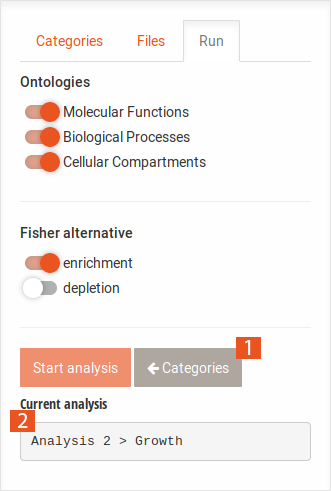
Run tab after analysis

  1. This button appears after you have performed an analysis on a specific category. Clicking it takes you back to the results of all categories.
  2. This field shows the name of the last analysis. The results in the main tabs refer to this analysis.

The Main Tabs

The main tabs display the set selection Venn diagram as well as the results of the analyses.
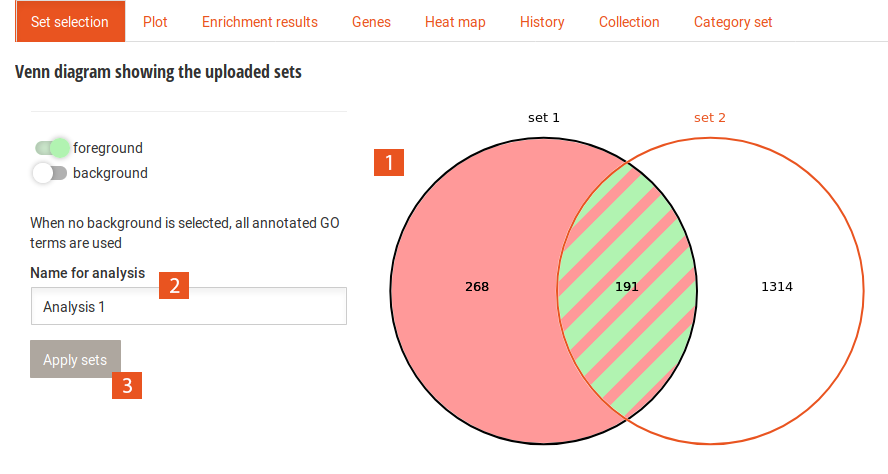
Set selection

Set selection tab

  1. After uploading data sets, a Venn diagram will be generated displaying the overlaps of the genes in the different data sets. You can then select which subset of genes should form the foreground and the background by selecting segments in the Venn diagram. When no background is selected, WEADE tests against the entire genome (all annotated genes with GO terms). This is different from selecting all segments, as this includes only the uploaded genes. Selecting no foreground will perform the analysis with all uploaded genes. This is the same as selecting all segments.
  2. Here you need to enter a name for the analysis. This name will be shown in the Current analysis field, in the history, the collection and in the heat map.
  3. After having selected a fore- and background and chosen a name for the analysis, you can apply the sets with this button. This enables the start analysis button.

Plot

Plot tab

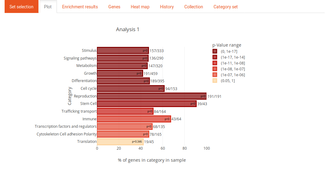
The plot tab contains a plot of the enrichment results. If a list of significant genes was used for the analysis (SEA), the length of the bars is the odds ratio (term-frequency). If the analysis was performed on a list of genes with a continuos measure (GSEA), the length of the bars corresponds to the delta rank of the MWU test. The color of the bars represents the p-Value.
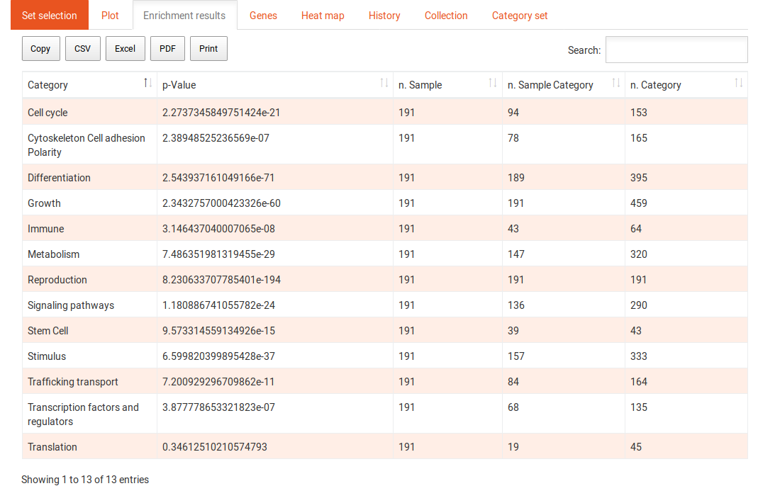
Enrichment Results

Enrichment results tab overview

The enrichment results tab shows the results in a tabular format. The first column contains the names of the categories, the second contains the p-values of the enrichment of those categories. The last three columns contain the numbers of genes in the sample, in the sample and in the category, and in the background and in the category, respectively, for SEA and the delta-rank for GSEA. The table can be sorted and filtered with the search and the results can be downloaded in several formats. Clicking on one of the categories shows the following options:
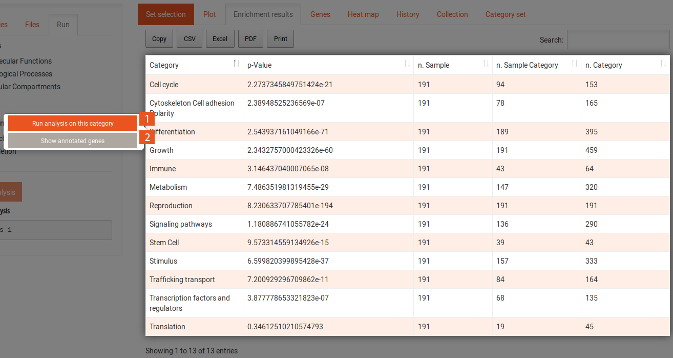
Enrichment results tab highlighted category

  1. This button allows you to perform the analysis on the GO terms that are annotated to the selected category. This shows their contribution to the enrichment result.
  2. This button takes you to the genes tab but filters the genes to include only the genes annotated to this category.

Enrichment results tab terms

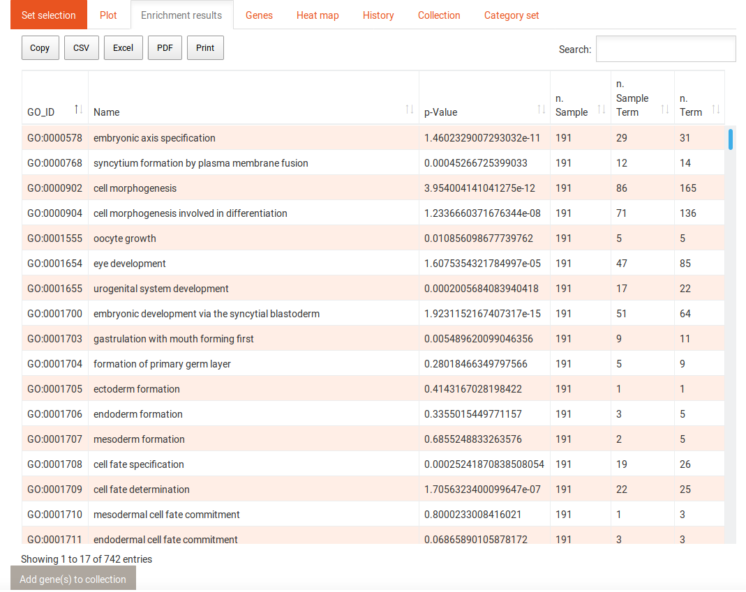
When you click on the Run analysis on this category button of a selected category, the enrichment results table will change to now include the terms that contribute to the enrichment of the category. You can use the Back to categories button in the Run tab to go back to the previous view of all categories. Selecting a term in this table reveals the following options:
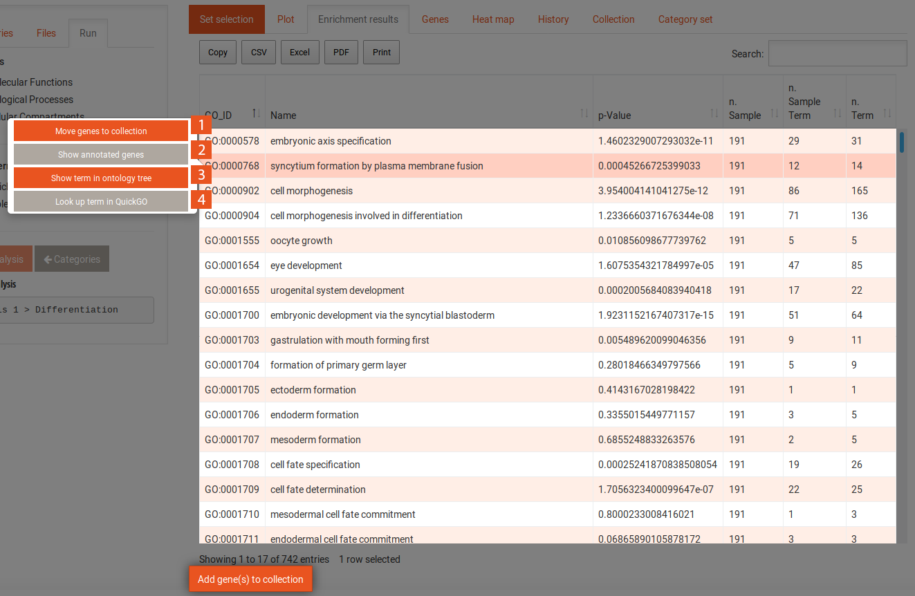
Enrichment results tab highlighted term

  1. This button moves all genes annotated to the term of your sample to the collection. You will be prompted to name your collection. This name will be prepended with the name of the current analysis as shown in the Current analysis field in the Run tab.
  2. This button takes you to the genes tab but filters the genes to include only the genes annotated to this term.
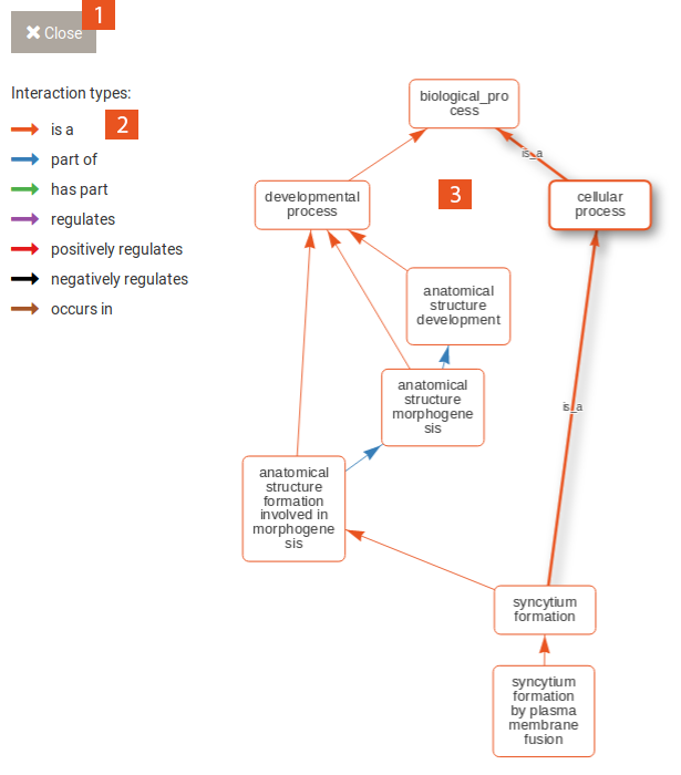
  3. This button opens an overlay that shows the selected term in its context of the Gene Ontology tree.
  4. This button takes you QuickGO, where you can find more information about the selected GO term.

Term in ontology context

  1. Click this button to close the overlay.
  2. The different edge types of the Gene ontology and their colours in the graph.
  3. This graph shows the selected term on the bottom and its relation to the root node of the ontology at the top.

Genes

Genes tab overview

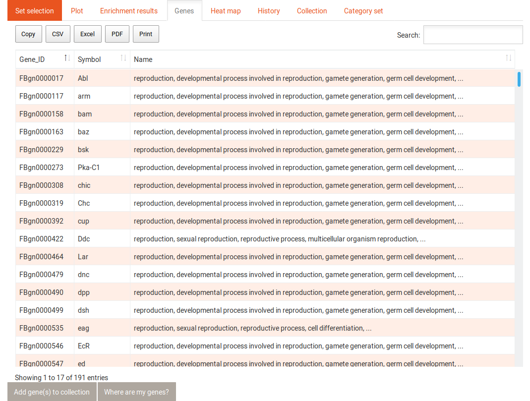
The gene tab contains a table with all genes and the category or term to which they were annotated. This table can also be sorted and filtered and its content be downloaded in several formats. Selecting one gene in this table shows the following information:
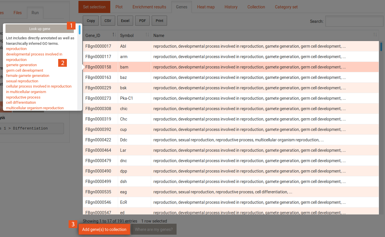
Genes tab highlighted gene

  1. This button takes you to a corresponding species data base with information on the gene.
  2. Here, a list of all categories or terms to which the gene is annotated is displayed. This includes direct annotations as well as those inferred through the hierarchical structure of the Gene Ontology.
  3. This button adds the selected gene to the collection. You will be prompted to name your collection. This name will be prepended with the name of the current analysis as shown in the Current analysis field in the Run tab.
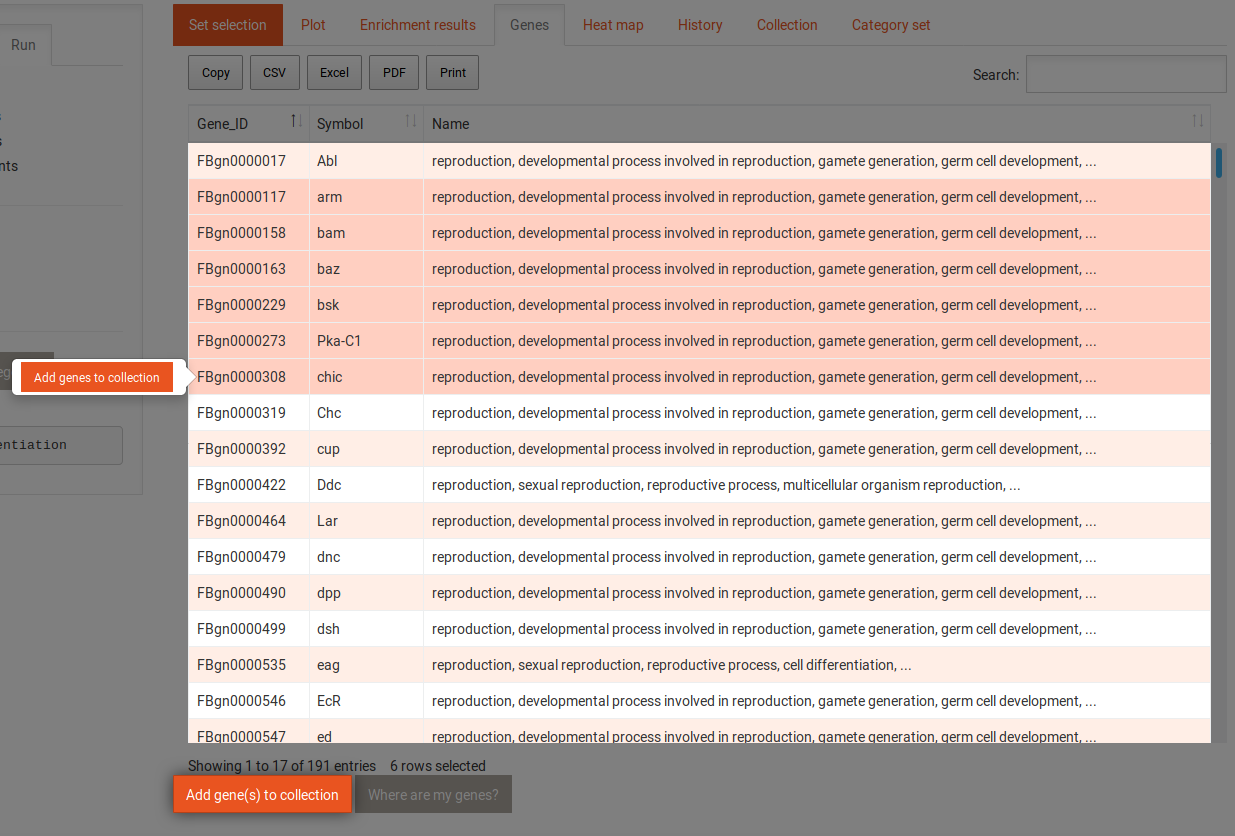
Selecting multiple genes (with shift or control/command keys) from the table allows you to add them to the collection together, with the button shown in the following image:

Genes tab highlighted genes

Heat Map

Heat map 2D

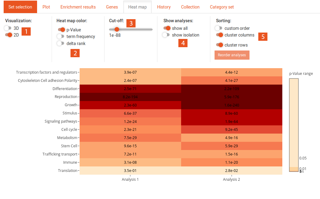
This tab shows a heat map of previous analyses, if at least two of the same type (SEA/GSEA) have been performed. The options for the heat map can be found above.
  1. Here you can choose between a 3D or a 2D representation of the heat map. Changing this also changes the available options slightly.
  2. This option controls, if the color of the heat map is used to represent the p-values (only available in 2D), the term frequency (for SEA) or the delta-rank (for GSEA). Results from GSEA and SEA can be displayed in the same heat map, if p-value is chosen.
  3. This option is only available when selecting p-value. Since the p-value can range across several orders of magnitude, it can be hard to see differences in either the high p-value ranges or the low. This cut-off allows you to adjust the distribution of colours across the p-value range to best fit your data.
  4. Here you can select between showing all analyses or those that you isolated in the History tab.
  5. By default, the columns and rows are clustered to minimize differences between neighbouring values. You can turn of the clustering for columns, rows, or both. When turning of clustering of columns, you can choose a custom order of the analyses by clicking the Reorder analyses button and rearranging them to your liking.

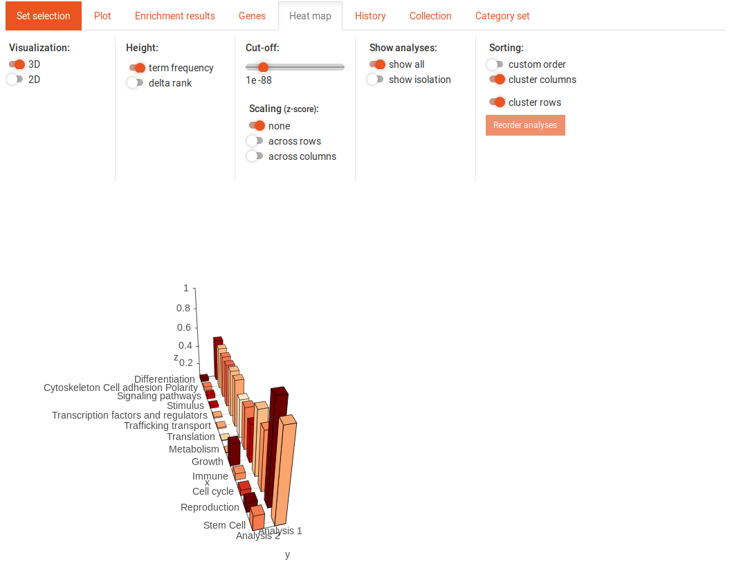
Heat map 3D

This image shows the 3D heat map. You can move the view around by clicking on it and dragging. In the 3D heat map, the colour always corresponds to the p-value. You can adjust the colour cut-off in the same way as in the 2D heat map. The height of the bars represent either the term-frequency (SEA) or the delta-rank (GSEA). You can display either the absolute values of the term-frequency and delta-rank or use scaling with the z-score. This scaling can be done across columns or across rows.
History

History tab overview

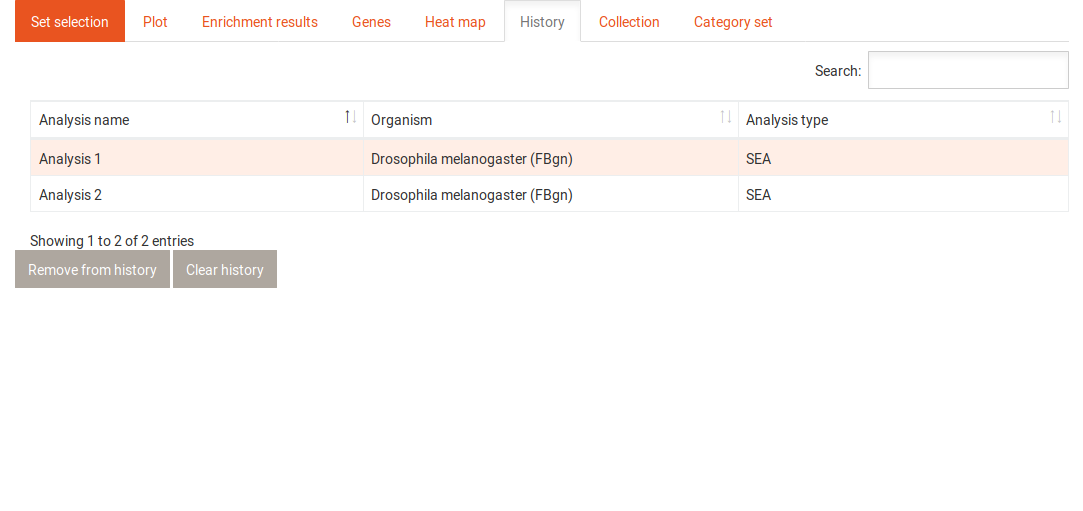
The history tab contains a table with all previously performed analyses. It shows the name of each analysis, the organism that was used and the type of analysis (SEA/GSEA). Clicking on one of the analyses gives you access to the following options:

History tab highlighted one

  1. This button allows you to return to the results of the selected analysis.
  2. Clicking this button removes the selected analysis permanently from the history and thereby from the heat map.

History tab highlighted multiple

  1. When you selected two analyses, you can test for potential pairwise interactions between their genes.
  2. When you selected two or more analyses, you can isolate them in the heat map to display them separately from the other analyses.

Pairwise interactions

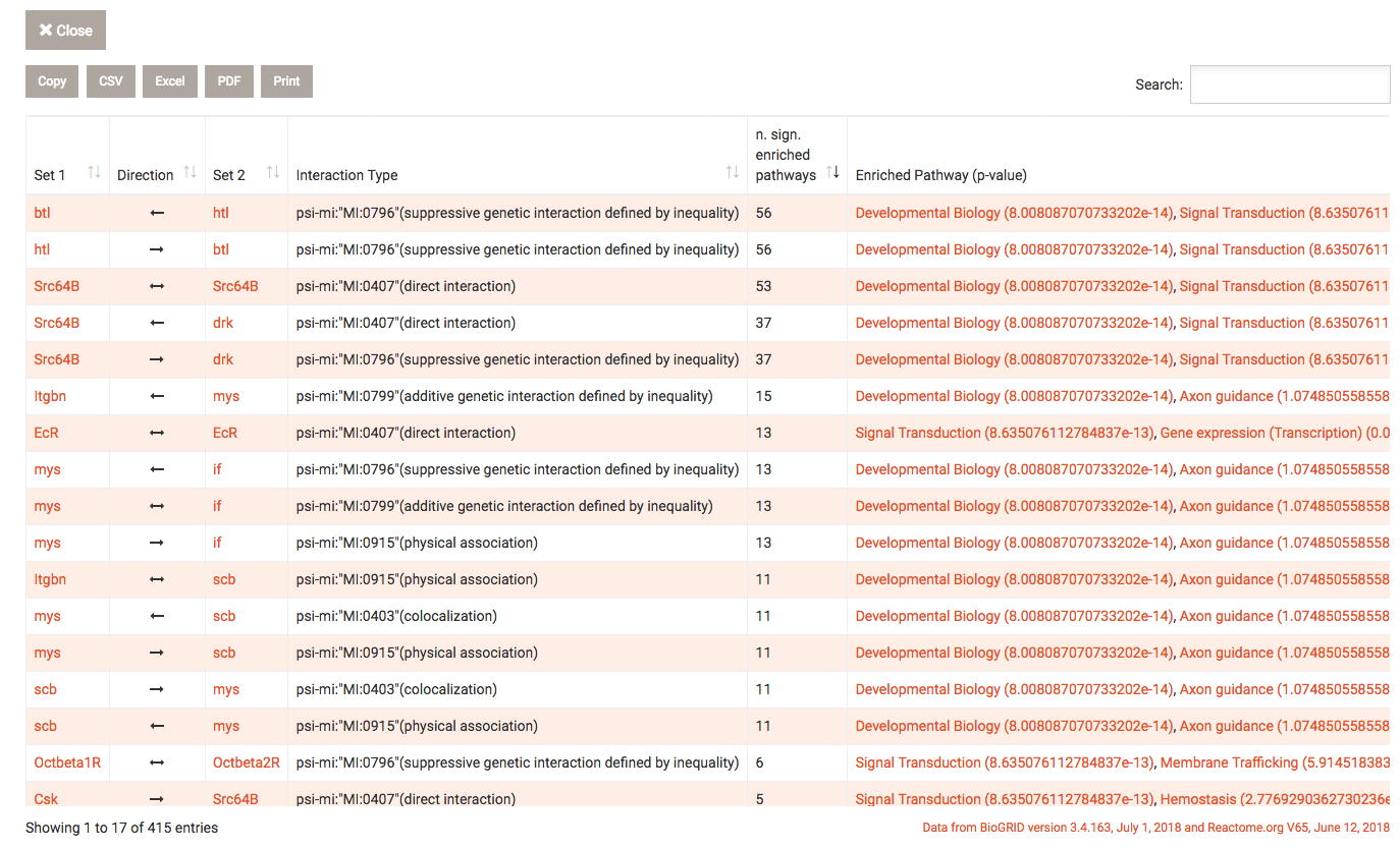
Clicking on the Find pairwise interactions button after selecting two analyses in the history, this overlay is shown. BioGRID interaction data is used to find interactions between genes or gene products where one of the interaction partners is present in the first analysis and the other in the second analysis. WEADE filters these results for genes that include either the GO term "ligand" or "receptor".
Using Reactome.org data, WEADE tries to determine to which pathway this interaction may belong to. The genes of the two data sets are then tested for enrichment in the pathways. Significantly enriched pathways are reported next to the interaction.
To exit from the overlay, click the close button.
Collection

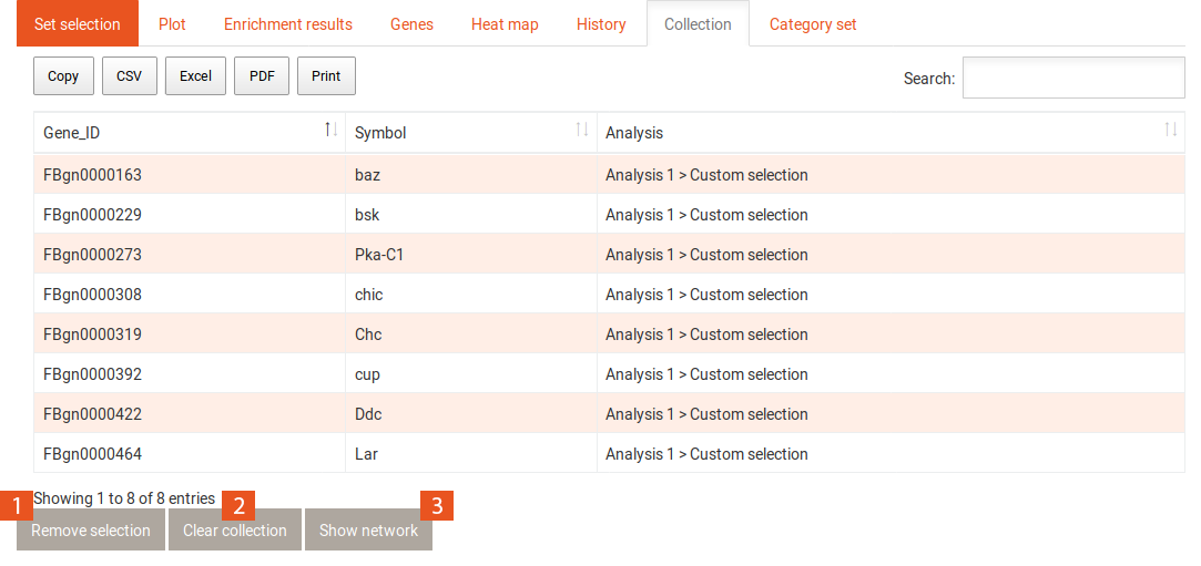
Collection tab

The collection shows a table of genes that have been added to it from the Genes or the Enrichment results tab. The gene identifier and the gene symbol are shown for each gene, as well as from where the gene has been added to the collection.
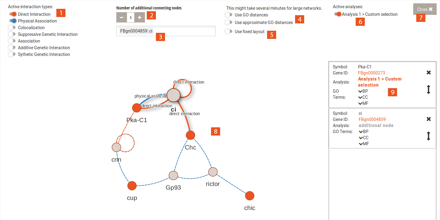
  1. Selecting genes from the table and clicking this button removes them from the collection.
  2. This button removes all genes from the collection.
  3. This button opens an overlay with an interaction network of the genes in the collection.

Interaction network

The interaction network uses BioGRID data to find interactions between genes and gene products of the selection.
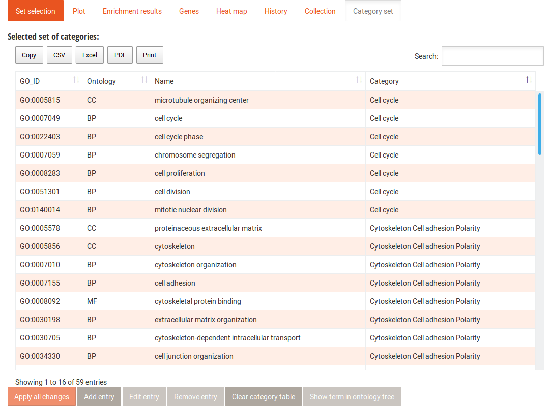
  1. Here you can choose which types of interactions will be used for creating the graph.
  2. Adding additional connecting nodes can give you a more comprehensive view of the interaction network, including genes that are not in your collection.
  3. You can search for a specific gene in the network.
  4. WEADE can use the semantic similarity of the terms annotated to the genes to cluster the interaction network. Genes which share many GO terms will be connected with shorter edges, Genes which share few or no GO terms get longer edges. Calculating the distances for large networks can take long, you might want to use approximations of the distances in this case.
  5. For larger networks, the interactive and dynamic network representation may be slow. Using a fixed layout can help.
  6. Here you can choose, genes from which collection will be used to build the graph.
  7. This button closes the overlay.
  8. The network view where nodes represent genes or their products and edges their interactions.
  9. Clicking on a node in the network will add an info box to this panel. Here you find information on the gene and the GO terms that are annotated to it.

Category Set

Category set tab

In this table, the GO terms that contribute to each category are listed. From here you can add terms to any of the categories, add new categories, and remove terms. You can also show the terms in their context in the Gene Ontology graph. After editing the category set, you can click the Apply all changes button. This creates a new category set in the drop-down menu in the Categories side tab for the duration of the session. It will automatically be selected for your next analyses.